pacman::p_load(sf, sfdep, tmap, plotly, tidyverse, zoo, Kendall)In-class Exercise 7: Emerging Hot Spot Analysis: sfdep methods
Getting Started
Installing and Loading R Packages
As usual, p_load() of pacman package will be used to check if the necessary packages have been installed in R, if yes, load the packages on R environment.
Five R packages are need for this in-class exercise, they are: sf, sfdep, tmap, and tidyverse.
The Data
For the purpose of this in-class exercise, the Hunan data sets will be used. There are two data sets in this use case, they are:
Hunan, a geospatial data set in ESRI shapefile format, and
Hunan_GDPPC, an attribute data set in csv format.
Before getting started, reveal the content of Hunan_GDPPC.csv by using Notepad and MS Excel.
Importing geospatial data
In the code chunk below, st_read() of sf package is used to import Hunan shapefile into R.
hunan <- st_read(dsn = "data/geospatial",
                 layer = "Hunan")
Reading layer `Hunan' from data source
`C:\HoYongQuan\IS415-GAA(New)\In-Class_Ex\In-Class_Ex07\data\geospatial'
using driver `ESRI Shapefile'
Simple feature collection with 88 features and 7 fields
Geometry type: POLYGON
Dimension: XY
Bounding box: xmin: 108.7831 ymin: 24.6342 xmax: 114.2544 ymax: 30.12812
Geodetic CRS: WGS 84Importing Attribute Table
In the code chunk below, read_csv() of readr is used to import Hunan_GDPPC.csv into R.
GDPPC <- read_csv("data/aspatial/Hunan_GDPPC.csv")Rows: 1496 Columns: 3
── Column specification ────────────────────────────────────────────────────────
Delimiter: ","
chr (1): County
dbl (2): Year, GDPPC
ℹ Use `spec()` to retrieve the full column specification for this data.
ℹ Specify the column types or set `show_col_types = FALSE` to quiet this message.Creating Time Series Cube
Before getting started, students must read this article to learn the basic concept of spatio-temporal cube and its implementation in sfdep package.
In the code chunk below, spacetime() of sfdep ised used to create an spatio-temporal cube.
GDPPC_st <- spacetime(GDPPC, hunan,
                      .loc_col = "County",
                      .time_col = "Year")
Next, is_spacetime_cube() of sfdep package will be used to varify if GDPPC_st is indeed an space-time cube object.
is_spacetime_cube(GDPPC_st)[1] TRUEThe TRUE return confirms that GDPPC_st object is indeed an time-space cube.
Computing Gi*
Next, we will compute the local Gi* statistics.
Deriving the Spatial Weights
The code chunk below will be used to identify neighbors and to derive an inverse distance weights.
GDPPC_nb <- GDPPC_st %>%
  activate("geometry") %>%
  mutate(nb = include_self(st_contiguity(geometry)),
         wt = st_inverse_distance(nb, geometry,
                                  scale = 1,
                                  alpha = 1),
         .before = 1) %>%
  set_nbs("nb") %>%
  set_wts("wt")
! Polygon provided. Using point on surface.Warning in st_point_on_surface.sfc(geometry): st_point_on_surface may not give
correct results for longitude/latitude dataNote that this dataset now has neighbors and weights for each time-slice.
head(GDPPC_nb)spacetime ────Context:`data`88 locations `County`17 time periods `Year`── data context ────────────────────────────────────────────────────────────────# A tibble: 6 × 5
Year County GDPPC nb wt
<dbl> <chr> <dbl> <list> <list>
1 2005 Anxiang 8184 <int [6]> <dbl [6]>
2 2005 Hanshou 6560 <int [6]> <dbl [6]>
3 2005 Jinshi 9956 <int [5]> <dbl [5]>
4 2005 Li 8394 <int [5]> <dbl [5]>
5 2005 Linli 8850 <int [5]> <dbl [5]>
6 2005 Shimen 9244 <int [6]> <dbl [6]>Computing Gi*
We can use these new columns to manually calculate the local Gi* for each location. We can do this by grouping by Year and using local_gstar_perm() of sfdep package. After which, we use unnest() to unnest gi_star column of the newly created gi_starts data.frame.
gi_stars <- GDPPC_nb %>%
  group_by(Year) %>%
  mutate(gi_star = local_gstar_perm(
    GDPPC, nb, wt)) %>%
  tidyr::unnest(gi_star)
Mann-Kendall Test
With these Gi* measures we can then evaluate each location for a trend using the Mann-Kendall test. The code chunk below uses Changsha county.
cbg <- gi_stars %>%
  ungroup() %>%
  filter(County == "Changsha") |>
  select(County, Year, gi_star)
Next, we plot the result by using ggplot2 functions.
ggplot(data = cbg,
       aes(x = Year,
           y = gi_star)) +
  geom_line() +
  theme_light()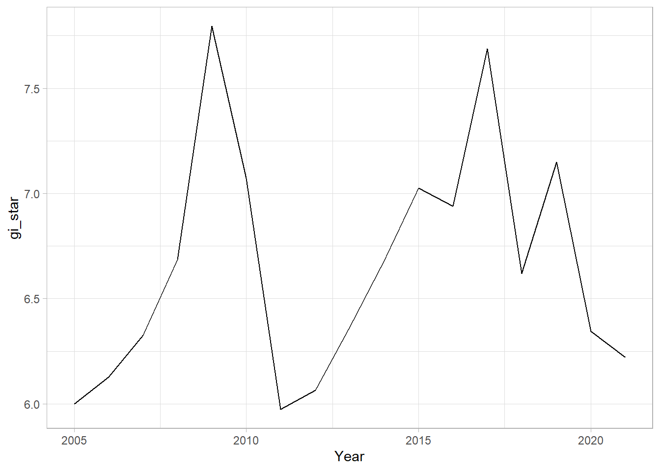
We can also create an interactive plot by using ggplotly() of plotly package.
p <- ggplot(data = cbg,
       aes(x = Year,
           y = gi_star)) +
  geom_line() +
  theme_light()

ggplotly(p)
cbg %>%
summarise(mk = list(
unclass(
Kendall::MannKendall(gi_star)))) %>%
tidyr::unnest_wider(mk)# A tibble: 1 × 5
tau sl S D varS
<dbl> <dbl> <dbl> <dbl> <dbl>
1 0.191 0.303 26 136. 589.In the above result, sl is the p-value. This result tells us that there is a slight upward but insignificant trend.
We can replicate this for each location by using group_by() of dplyr package.
ehsa <- gi_stars %>%
  group_by(County) %>%
  summarise(mk = list(
    unclass(
      Kendall::MannKendall(gi_star)))) %>%
  tidyr::unnest_wider(mk)
Arrange to show significant emerging hot/cold spots
emerging <- ehsa %>%
  arrange(sl, abs(tau)) %>%
  slice(1:5)
Performing Emerging Hotspot Analysis
Lastly, we will perform EHSA analysis by using emerging_hotspot_analysis() of sfdep package. It takes a spacetime object x (i.e. GDPPC_st), and the quoted name of the variable of interest (i.e. GDPPC) for .var argument. The k argument is used to specify the number of time lags which is set to 1 by default. Lastly, nsim map numbers of simulation to be performed.
ehsa <- emerging_hotspot_analysis(
  x = GDPPC_st,
  .var = "GDPPC",
  k = 1,
  nsim = 99
)
Visualising the distribution of EHSA classes
In the code chunk below, ggplot2 functions ised used to reveal the distribution of EHSA classes as a bar chart.
ggplot(data = ehsa,
       aes(x = classification)) +
  geom_bar()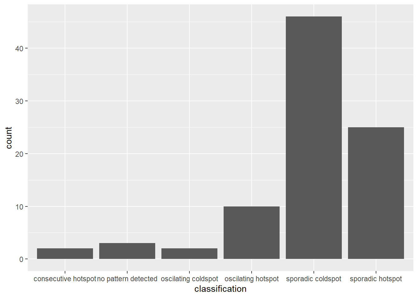
Figure above shows that sporadic cold spot class has the high numbers of county.
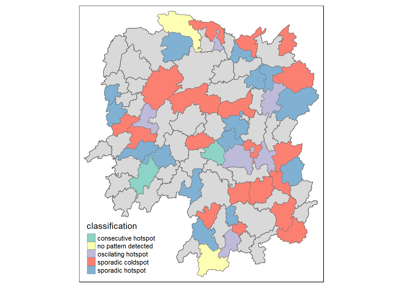
Visualising EHSA
In this section, you will learn how to visualise the geographic distribution EHSA classes. However, before we can do so, we need to join both hunan and ehsa together by using the code chunk below.
hunan_ehsa <- hunan %>%
  left_join(ehsa,
           by =  c("County" = "location"))
Next, tmap functions will be used to plot a categorical choropleth map by using the code chunk below.
ehsa_sig <- hunan_ehsa  %>%
  filter(p_value < 0.05)
tmap_mode("plot")
tmap mode set to plottingtm_shape(hunan_ehsa) +
tm_polygons() +
tm_borders(alpha = 0.5) +
tm_shape(ehsa_sig) +
tm_fill("classification") +
tm_borders(alpha = 0.4)Warning: One tm layer group has duplicated layer types, which are omitted. To
draw multiple layers of the same type, use multiple layer groups (i.e. specify
tm_shape prior to each of them).